Hearts App

Hearts is a dating app project for US-based users. Users can view each other’s profiles, like and bookmark others, and see who viewed their profile without having to pay for it. Users have to pay only to start a conversation. There's no membership subscription on Hearts.

2022
CLIENT
Techrupt Innovations
END USERS
United States

Scope

The scope of the project was to create a habit-forming product. Or at least something as close to it as possible. The problem is that dating apps are like seasonal products. Users don't necessarily need them after some time. So I was careful that the interests of the investors and the founders of the company shouldn't come into conflict with the interests of the users. It should have the necessary ticks and triggers, as well as the necessary variable rewards.

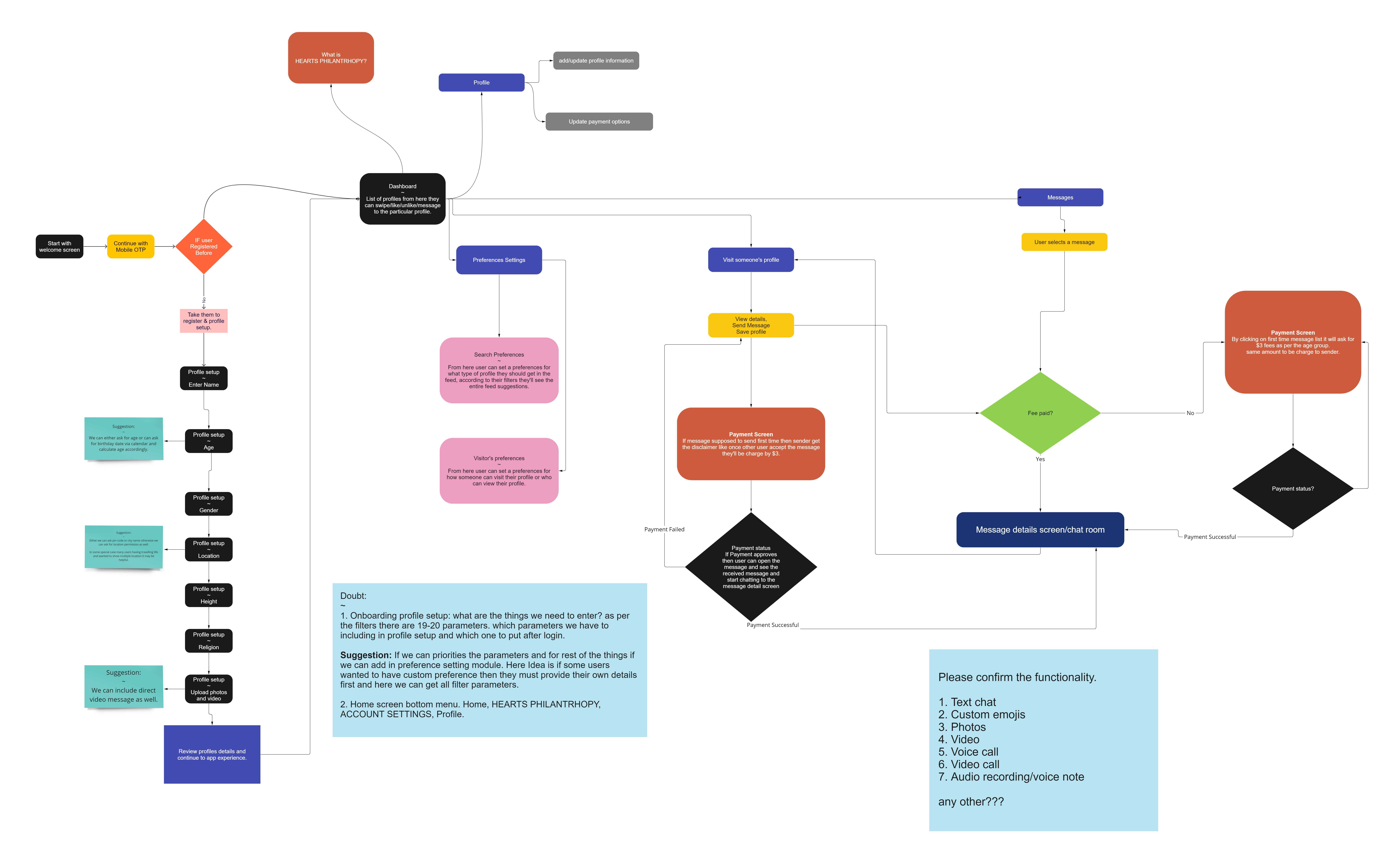
User Flow

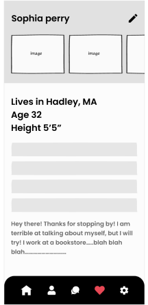
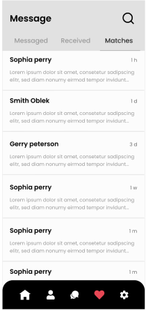
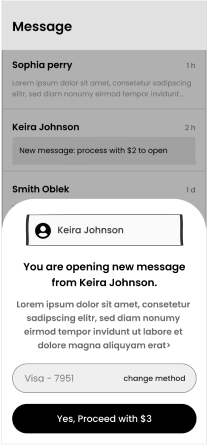
Wireframes

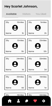
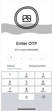
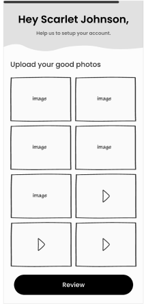
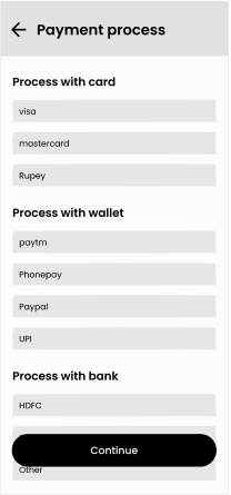
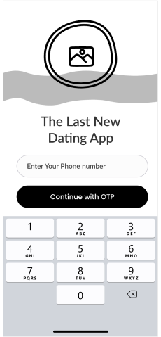
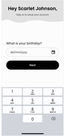
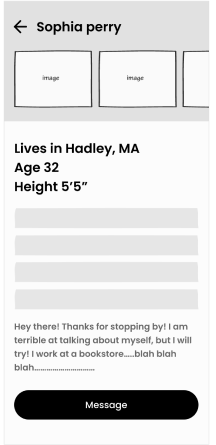
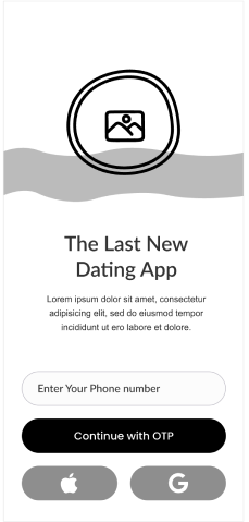
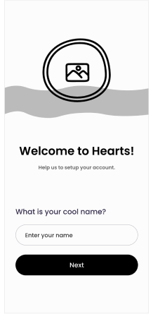
I've shown the wireframes that I had designed for Hearts below. The app went through significant UX changes on some screens after I started converting these screens to an actual prototype. But this laid out a well-thought-out UX skeleton for me to work on.

Onboarding New Users

I strongly believe that startups shouldn't get an app done and move forward. UX is an ongoing process. The primary focus should be to roll out the MVP. Once it is out we need to get it into a continuous process of updates that make users' life easy. Projects like hearts and in fact most end-user-facing projects need that.

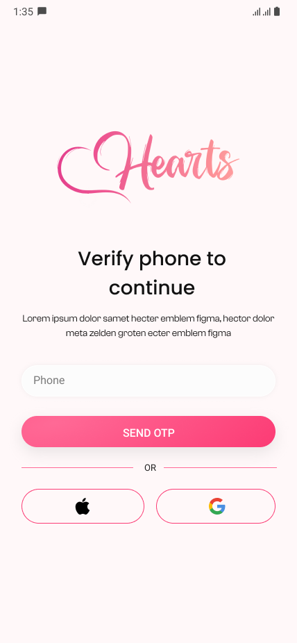
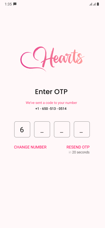
The investors, Hari and Setuj wanted to provide multiple login/sign up methods - Facebook, Google, Apple ID, phone, and email. We went through a couple of conversations after I tried to convice them to reduce it to just phone, Apple ID and Google (at most).

Because less is more. And everyone today is on Google or Apple accounts. It's just a necessity. Worst case, they'll use their phone number.

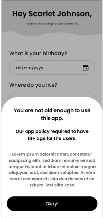
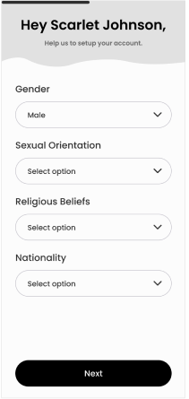
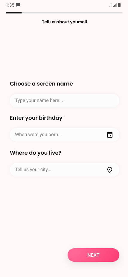
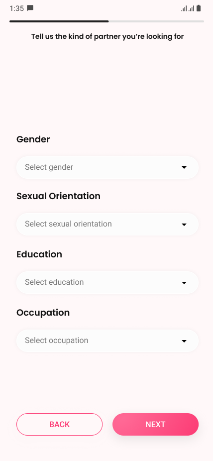
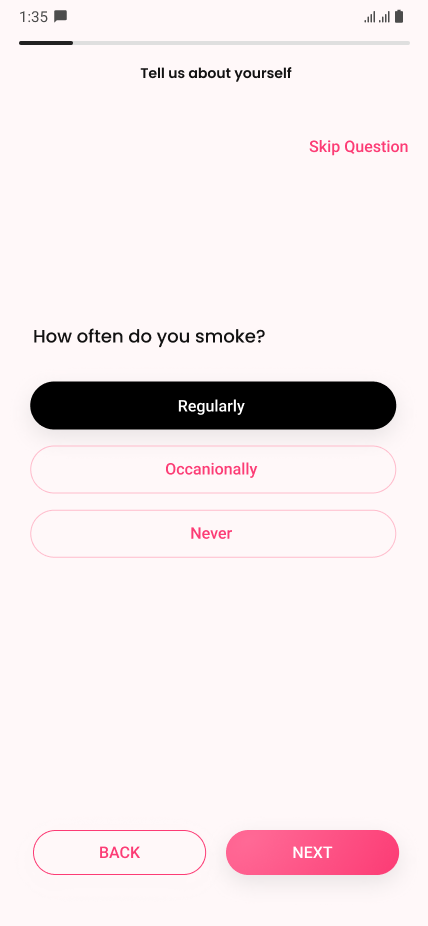
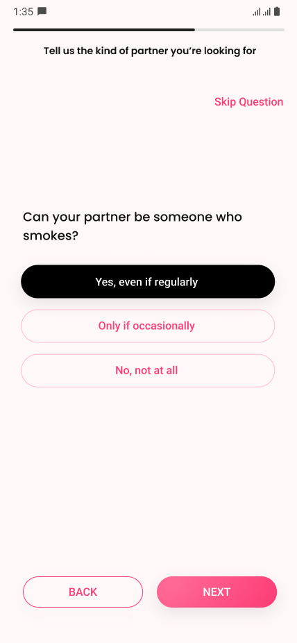
The app then verifies if this is an existing user. If not, it would ask the user a couple of onboarding questions that Hearts app's algorithm would use to give them a better experience. This brings us back to why UX is an ongoing flow. I mean, these questions are a wall at the very beginning of the app. Each question adds to the time it takes for the user to access what he/she came here for - finding people.

If this would have been an ongoing process we could have used some data over a period of time and more research to reduce or get rid of these questions.

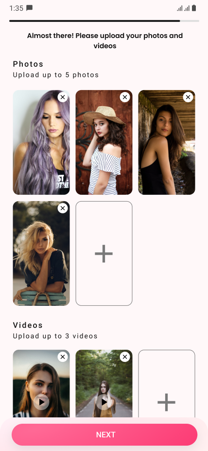
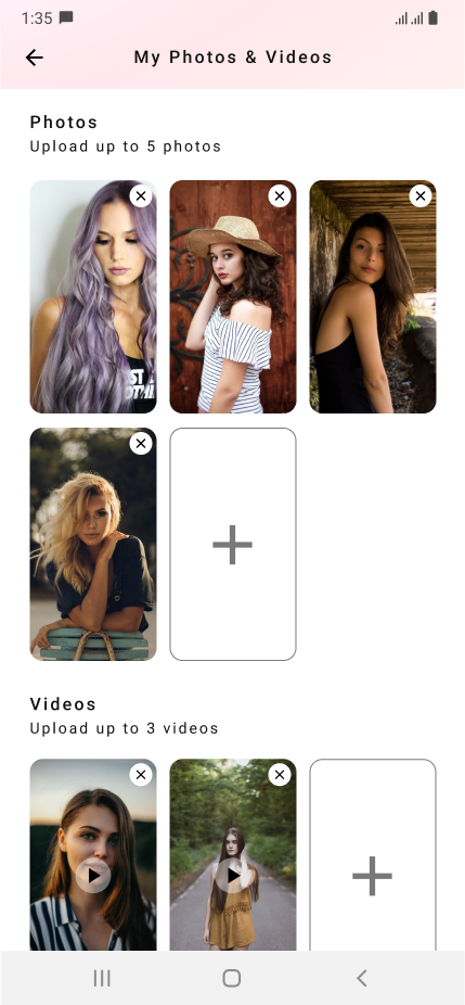
Finally, after the questions, the app asks the users to upload images and videos to their profiles. Videos were optional. Based on my research I think videos work as more powerful emotional triggers when used to capture moments. So this was a good add-on to Hearts

I did cross-comparison research of about 10 dating applications to design the app.

Pay To Talk

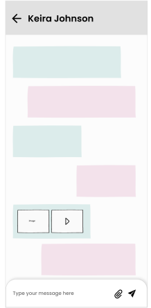
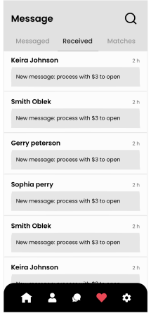
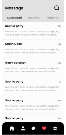
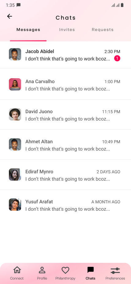
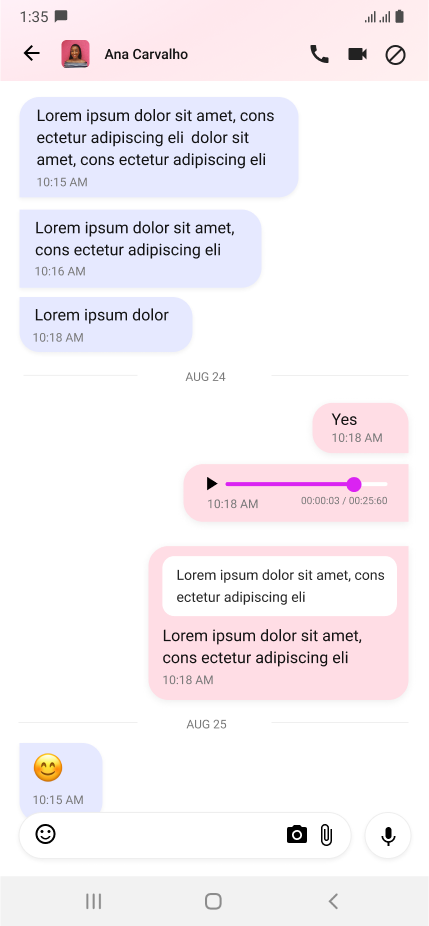
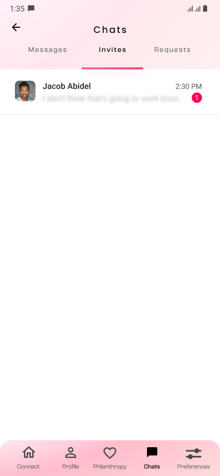
Chat module was divided into requests that were messages (conversations), chat requests sent to others, and chat invitations received from others. I'm not in favor of tabs and divisions most of the time, but I think these become necessary evil quite often in UX and UI. You wouldn't want the users to scroll too much nor get them confused between components as to which is which.

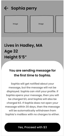
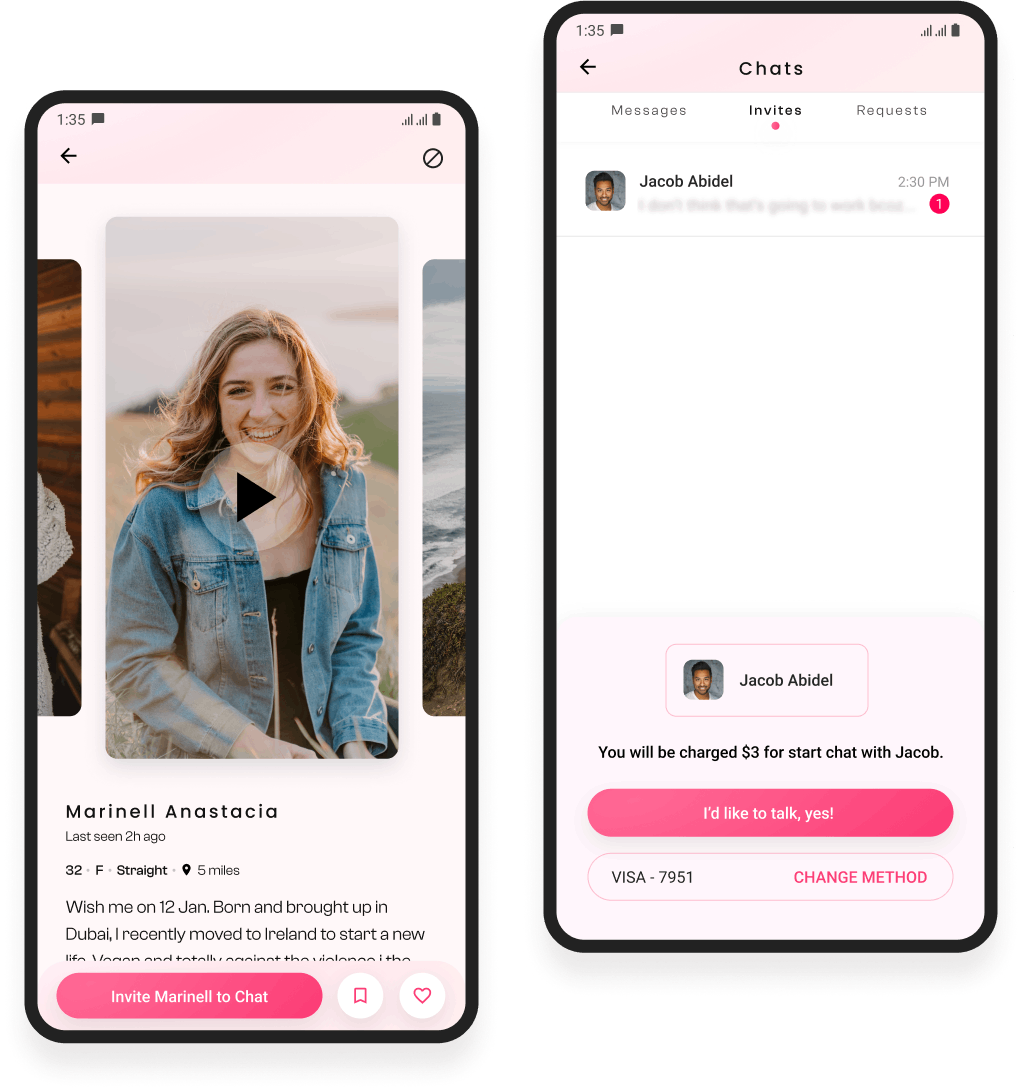
This brings up to the most important part of the chat - invitations. This is where Hearts makes money and more importantly stands out from other apps that hide user profiles only to be unlocked with subscription plans. You can visit as many profiles on hearts as you want, see photos and videos, bookmark and like profiles, and see who showed interest in you without having to pay for it.

Hearts, in fact, serves the purpose of letting you find the one at the least. This is where most dating apps fail.

Users hate subscription walls. Dr. B. J. Fogg pointed out elements of simplicity that define a task's difficulty. Three of which are time, money and physical efforts. Subscription walls cost you a good amount of money which you'd hate to spend, time that will potentially make you lose interest, and physical efforts of finding your credit/debit card to add it as a payment method to the app. Such walls, therefore, kill motivation to take the desired action.

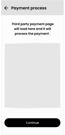
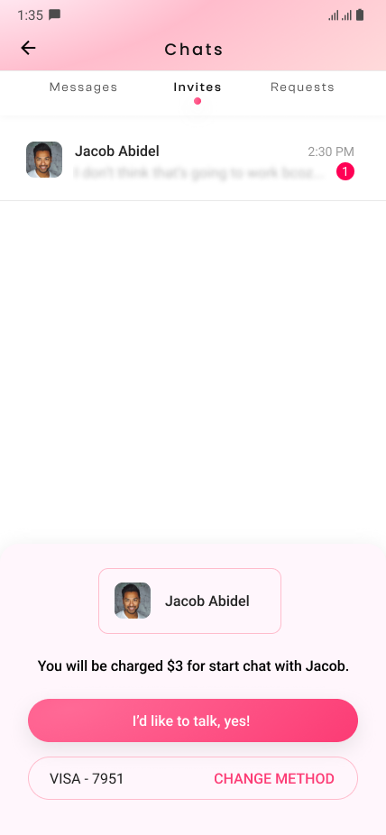
So Hearts clearly had the advantage here. I had to put a payment wall, though, when the user decided to chat with someone. But by this time the users have a good amount of motivation to complete this action. If they're truly interested in that profile they'd not mind paying $3 to chat with that person. And the amount asked is small. It's like on gaming apps where you pay smaller amounts to buy individual assets which you'd avoid if the same assets were sold to you in collections that were expensive. This method works very well.

I decided to blur the initial words of the message instead of not showing it at all. It's a great trigger and the investors really liked this idea.
Finding Matches

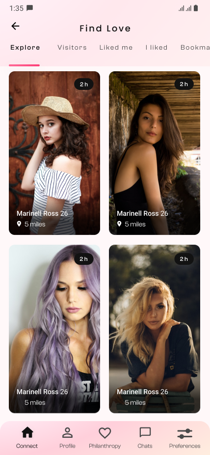
The default landing screen of the app was the connect screen with the 'Explore' tab selected. This would show results based on the users' preferences and previous activities on the app including who they showed interest in, bookmarked and liked profiles, which profiles they spent more time on, and the frequency of that.
The tabs on the top of the first screen let users see who visited, liked, and bookmarked their profile. Likewise, they can also see who they showed interest in previously.

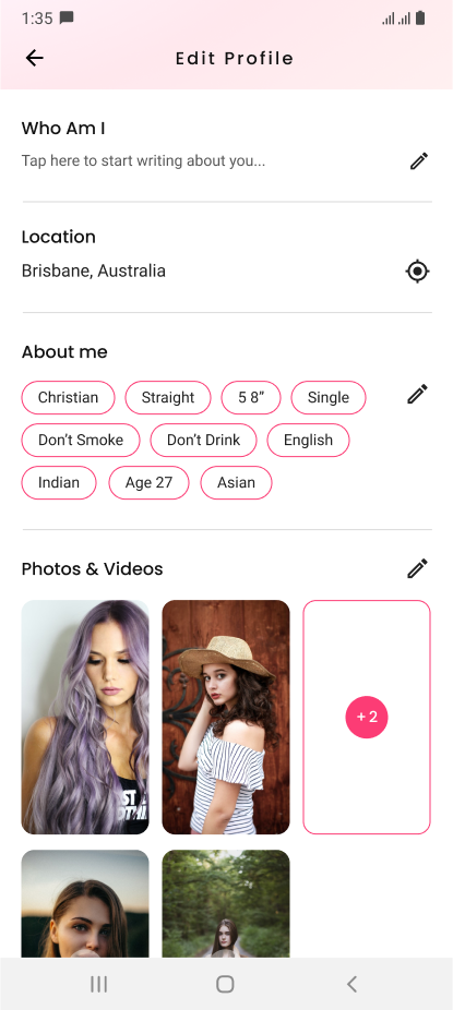
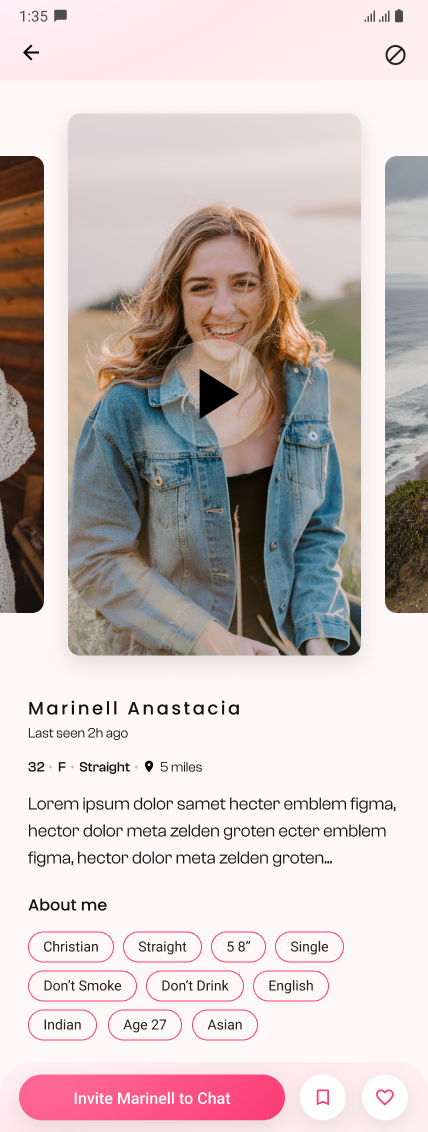
The profile screen shows the photos and videos in a carousel which users can swipe left and right to see. Gender, age, location, and last seen are important. This is what anyone would be first interested to see right after they see the photos and that's why I've placed these details right under the name. Users can add a short introduction of themselves along with other necessary things about them that will appear as tags under the 'About me' heading.

Profile, account, payment and more...

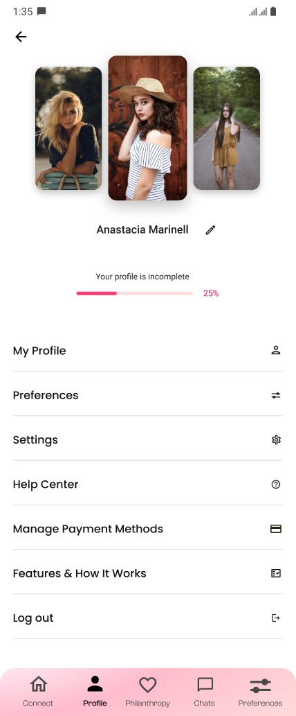
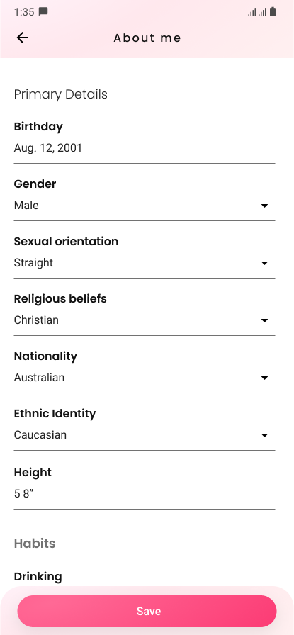
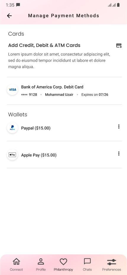
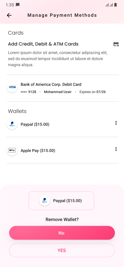
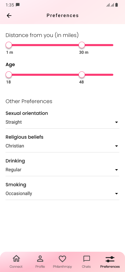
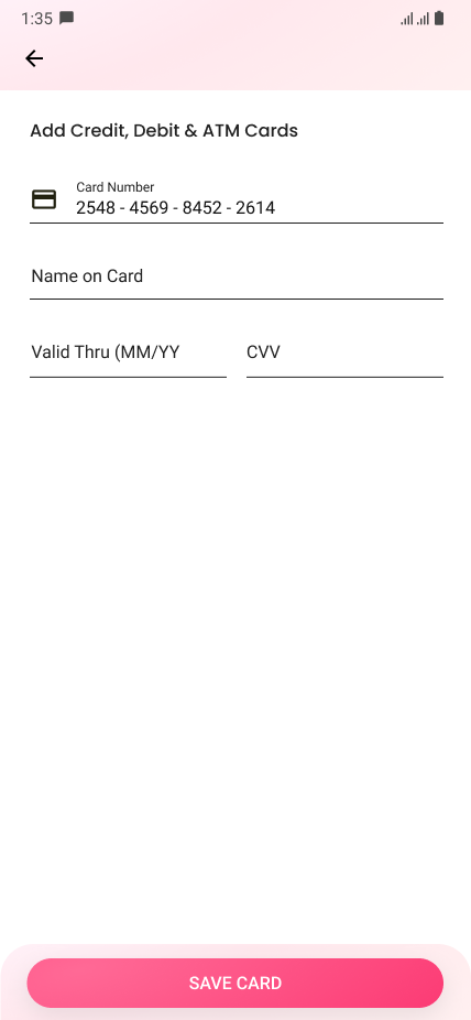
I've put all the important links related to account management on one screen - the profile screen. From here the user can choose to edit profile, manage preferences and payment methods, and access the help center.

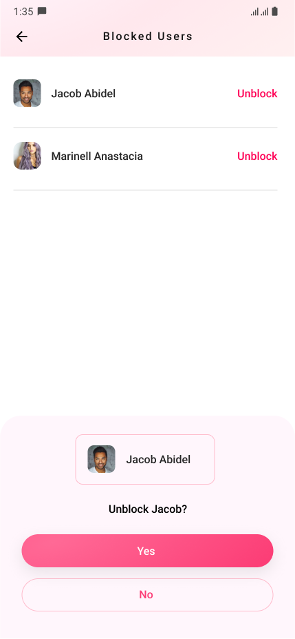
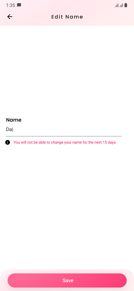
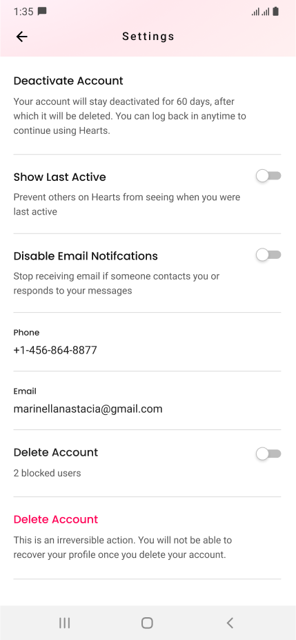
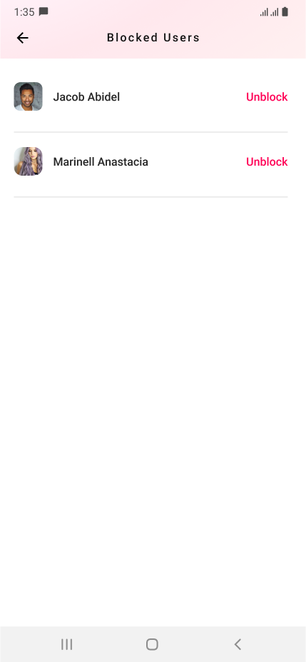
I wanted the app to be a genuine platform for people who're actually here for the right reasons and that's why I suggested that changing one's name shouldn't be frequent. I made the deactivate and delete account options easily accessible because users can be motivated to come back seeing that the platform respects their privacy concerns and is so easy in all ways. These ideas were in line with the ideas of the founders and the investors as well.

As you would see in the screens below the application has processes and components everywhere and I took time to research and design all of this.

Philanthropy

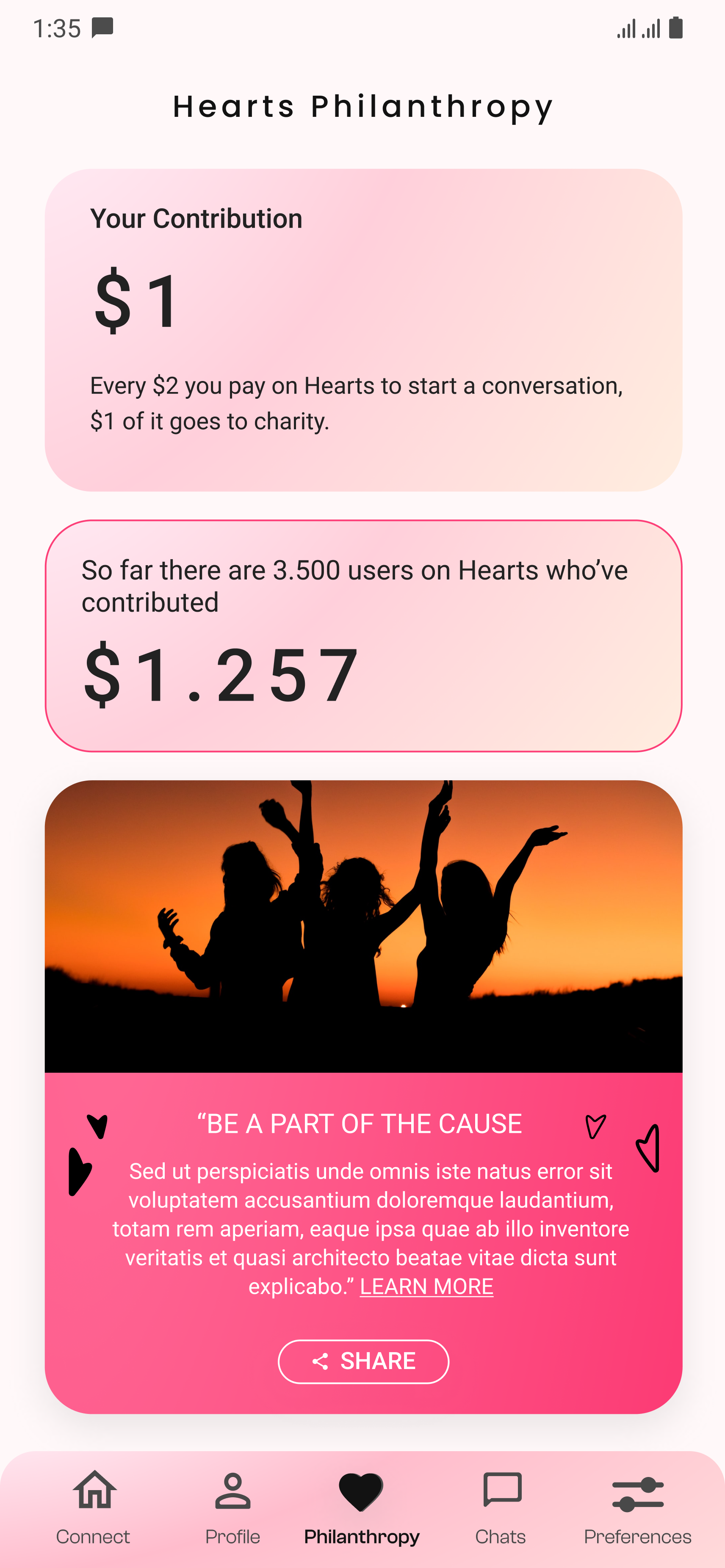
This screen was designed because the founders and investors wanted to highlight how this app was also helping a cause. I was not in favor of making this screen accessible directly from the footer, front and center.

I wanted to present this information more subtly when a transaction would happen, like a small notification that is clearly visible. I also wanted to make this screen secondary, by placing its link on the profile screen. And there are more ways we could have conveyed this message. More subtly, so to speak. But the investors were keen to have this like so, presented front and clear.

Let's Talk

Would you like to know more about this project. Book a meeting from my calendar.

Schedule Meeting
Let’s
connect.